
Strandbags Website
Redesign the Strandbags website so that it is reliable, stable and mirrors some of the bricks-and-mortar store concepts and designs being trialled in Blacktown in Sydney’s west and at Chadstone in Melbourne.
OVERVIEW
“How might we redesign the Strandbags e-commerce platform so that it is stable and reliable”
Strandbags wanted to redesign their website so that customers would have a better shopping experience and mirror some of the bricks-and-mortar store concepts and designs being trialled in Blacktown in Sydney’s west and at Chadstone in Melbourne.
Agency: MindArc
My Role: Lead UX/UI Designer
Timeframe: 3 months
Methods: Business Analysis, User Analysis, Problem Framing, Wireframing & Prototyping, Usability Testing and Rapid Iterations
Deliverables: Low Fidelity Wireframes, High Fidelity Wireframes, Dev Style Guide
THE APPROACH
THE PROBLEM
“The current e-commerce sites were relatively basic, comprising of a homepage and a product listing page”
• You couldn't put content into the product listing pages, it was very difficult to create stories, and it was difficult to change the experience.
• It was challenging to add payment options, leading to different services being offered in two countries.
• The underlying hosted infrastructure did not autoscale or easily handle large bursts of volume.
• There were no separate sections for ‘women’ and ‘men’ shoppers.
• But as the pandemic wore on, and physical stores were forced to close, pressure mounted on the company’s existing e-commerce properties.
PROJECT GOALS
“Setup onto a robust, e-commerce platform that will bring stability and reliability”
• Ensure the site is set up with best practice and ready for scaling as the business grows online.
• Reduce down the manual effort of processing orders (integrations)
• Ensure security is of a high standard and gives confdence to customers
• Enable Omni-Channel Experience (Gift Cards, Click and Collect, Find in Store)
• Improve Customer Loyalty Programme (smile.io)
• Personalisation Enablement (Nosto)
THE SOLUTION
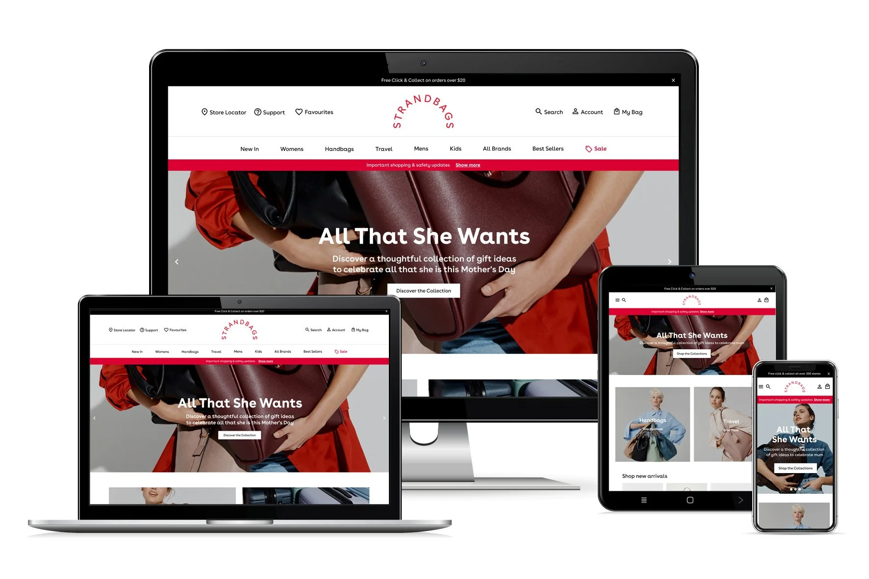
“Setup a robust, stable and reliable e-commerce platform that reflects bricks-and-mortar store designs”
• The pages are content-rich, and come embedded with recommendations powered by a Shopify plugin called Hi-Conversion that itself is powered by Amazon Personalize.
• A ‘smart search’ plug-in called Sajari is used to connect the search terms customers use to the products they actually wanted; this is then used to improve similar searches in future.
• Customers are shown which stores have stock they can click-and-collect, as well as warehouse availability of their desired product in near real-time, providing assurance before placing an order.
• The sites also have account management features for the first time, allowing customers to see their purchase history, change their details and - soon - to manage their participation in Strandbags’ loyalty scheme.
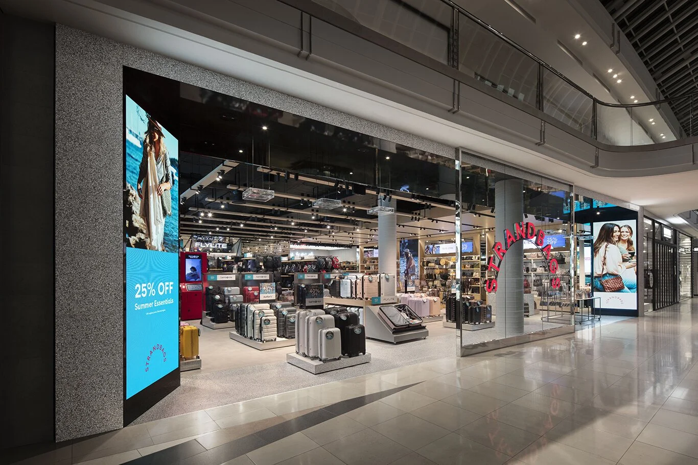
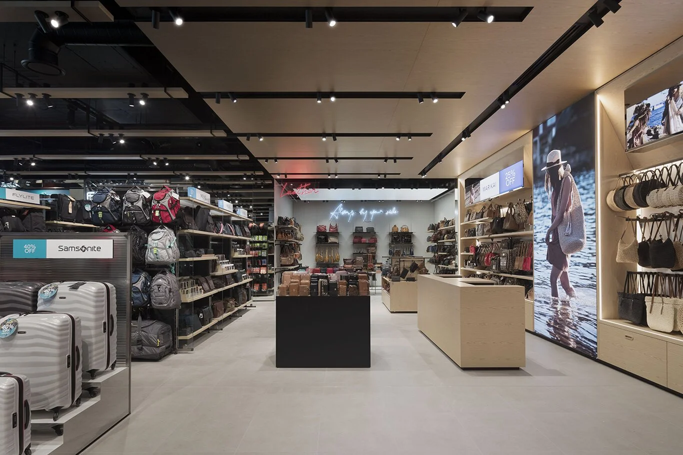
• Navigation and look-and-feel of the websites mirrors some of the bricks-and-mortar store concepts and designs being trialled in Blacktown in Sydney’s west and at Chadstone in Melbourne.
Link to interactive Figma Prototypes:
Mobile: https://www.figma.com/file/bP2eklLgdWrfzCyvcYsZ3Z/SB_MOBILE_WIREFRAMES_320_V6?node-id=1%3A2534&t=NKk7IY86ERlb3GXm-1
Desktop & Tablet: https://www.figma.com/file/g3DXpVmZag65KftHJlKnmm/SB_DESKTOP_WIREFRAMES_1440_V6?node-id=0%3A1&t=LTsmapdS4FACUcpI-1

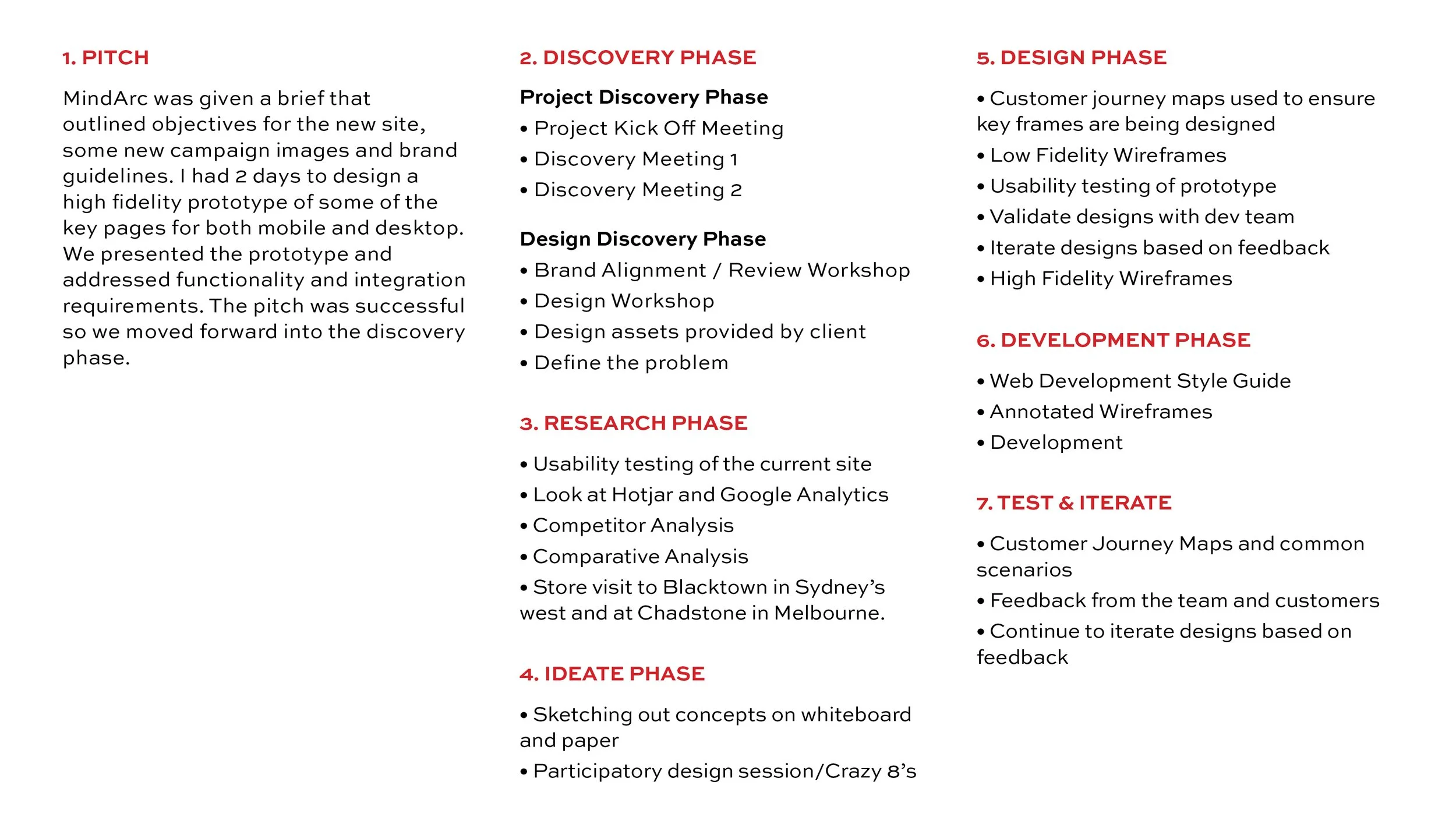
THE DESIGN PHASE
During this phase we talked through how we wanted to website to look based on experience with the legacy website, ideas from our creative team and website best practice. We wanted the new site to be refined and streamlined and really highlight the great products we sell.
We took over the conference room at the Strandbags head office and covered the walls with screenshots of the new website design. The enabled us to get feedback from our CEO and directors and enabled each of the business teams to provide their input.
We also had a number of visits to stores to look at how we could incorporate learnings from the store experience. These visits were invaluable and really helped us in building a great omnichannel digital experience.
IDEATION
“It’s time to start exploring the ideas”
Sketching
Now that I was inspired, I started to explore how users could navigate and move through the site by exploring various ideas and sketching them out on paper. I made sure to include interactions and design patterns that would fulfil customers expectations discovered in the research phase.
Participatory Design Session/ Crazy 8’s
Now we are inspired after doing the competitive and Comparative analysis, we started to explore how users could navigate and move through the site by exploring various ideas and sketching them out on paper with the team in a participatory design session.
I made sure to include interactions and design patterns that would fufill customers expectations discovered in the research phase.
Testing and feedback
After discussing the sketches with the team I iterated the designs. Some of the main changes I made were:
• More content blocks on the homepage
• Tiles on the homepage that take a customer to various categories
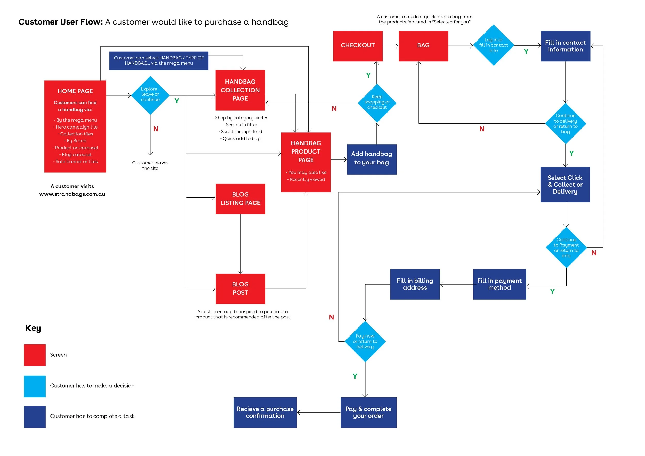
User flow
Before designing a digital prototype, I wanted to focus on discovering which wireframes were required to be produced that will allow the user to reach their goals when they are shopping on the Strandbags website. I created 2 flows for steps a user typically goes through in order to complete some common tasks - 1. Purchase a handbag and 2. Purchase a Suitcase
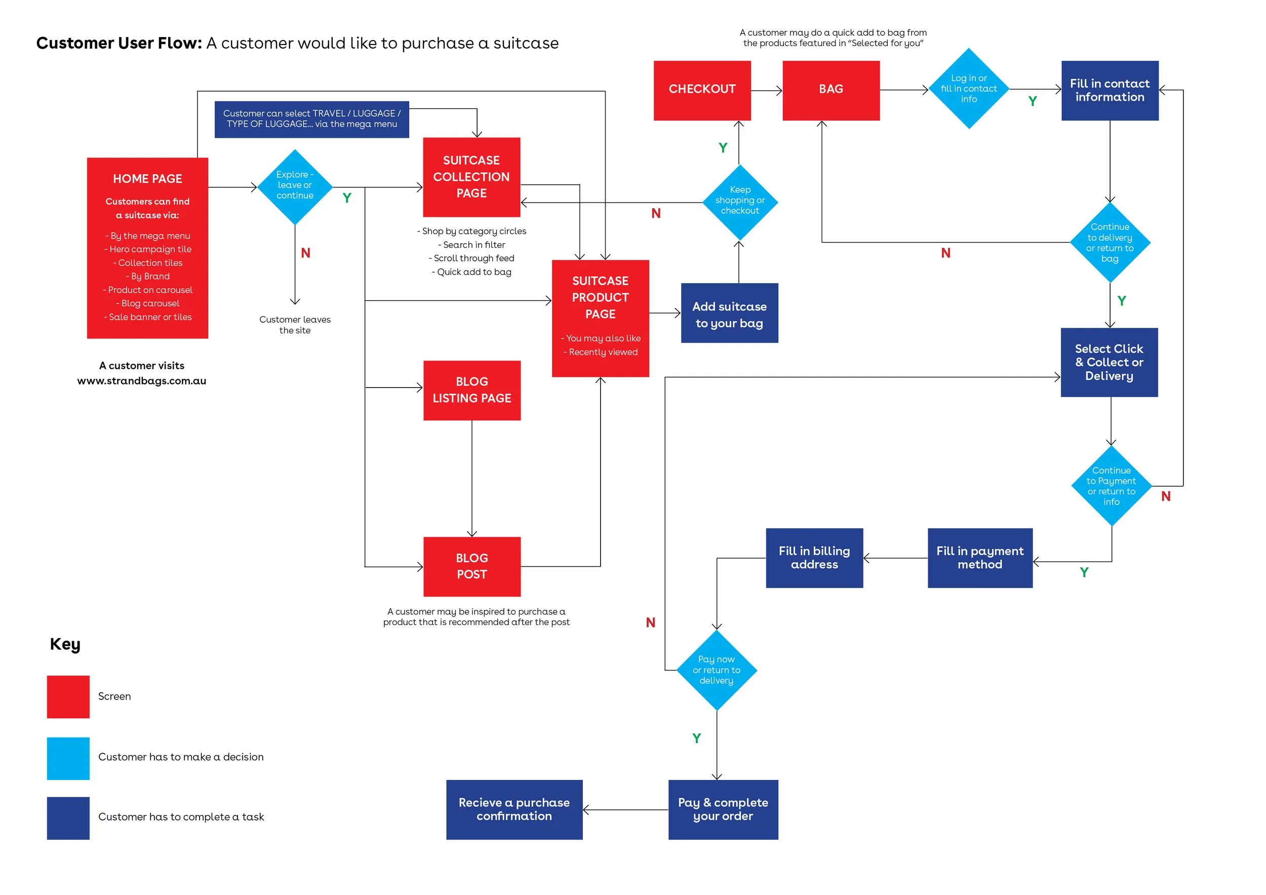
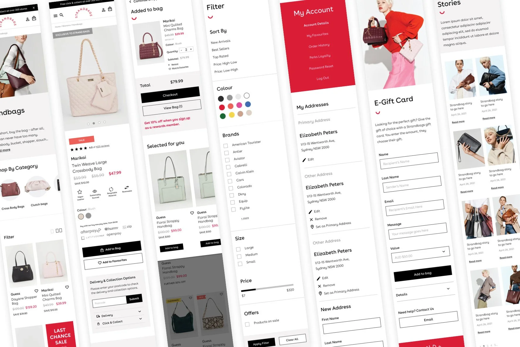
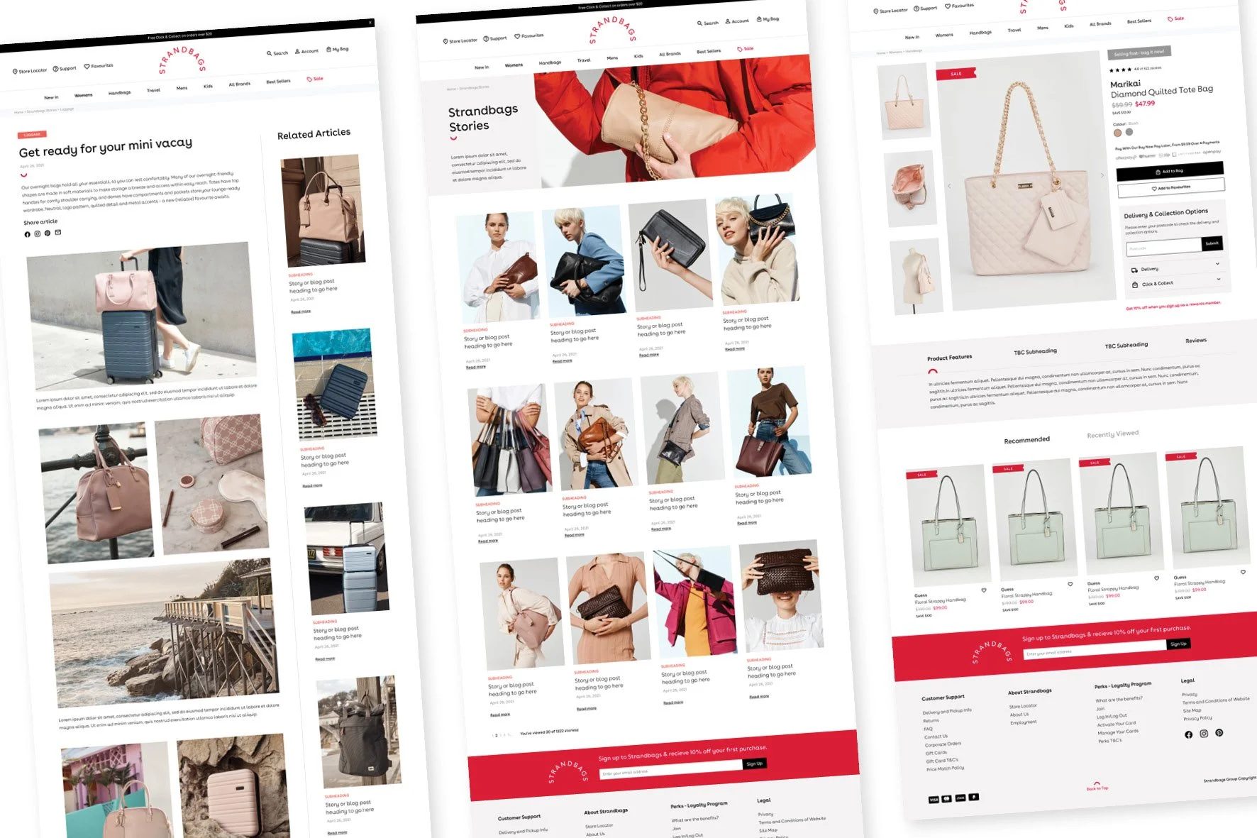
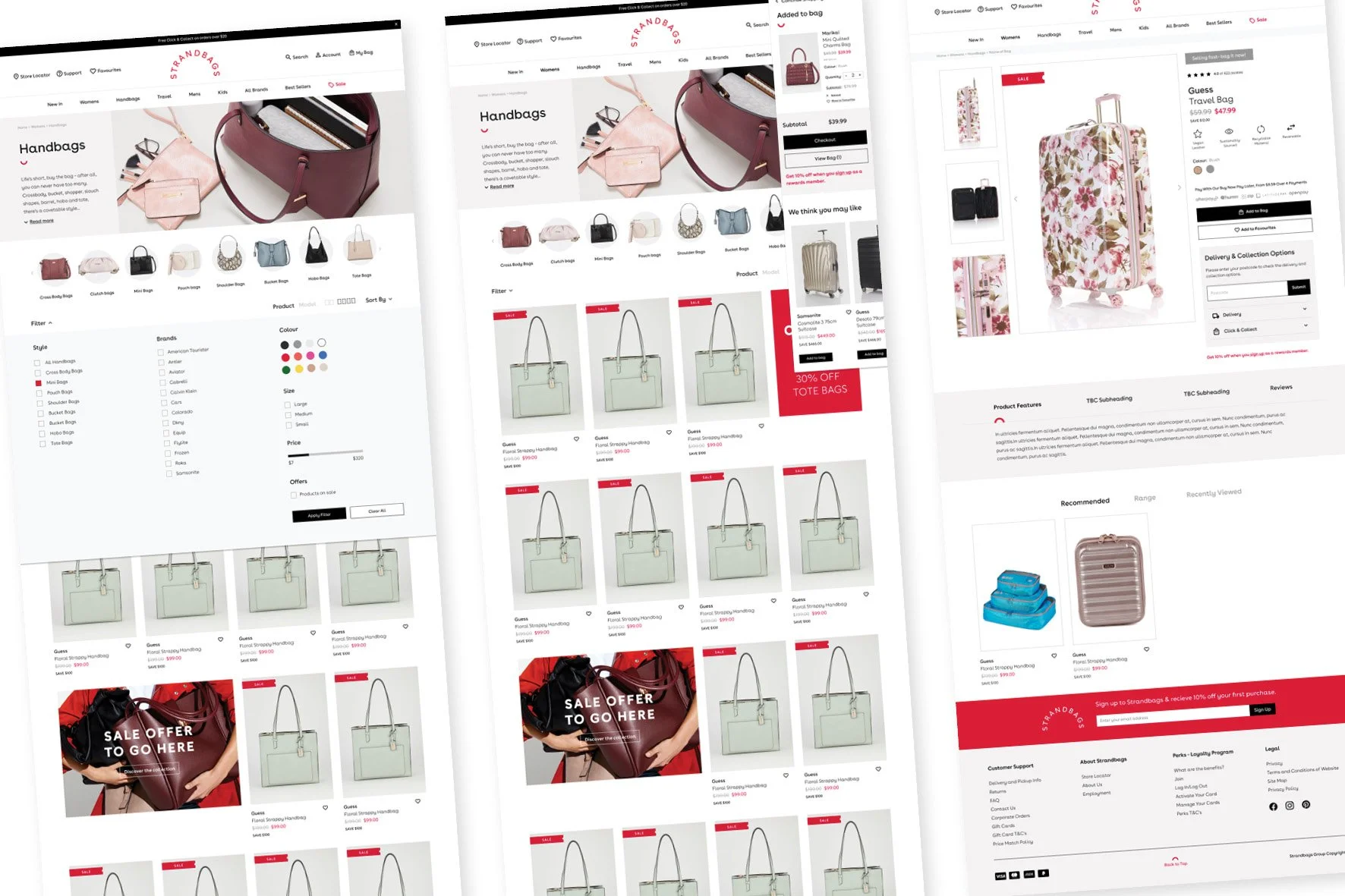
Wireframes
Now that I knew what screens are required I started designing low - mid fidelity wireframes in Figma to test before creating high fidelity wireframes.
DEVELOPMENT | INTERACTIVE PROTOTYPE
“Does it work?”
Now that I had wireframes, it was time to create a clickable prototype to test my ideas and validate the redesign.
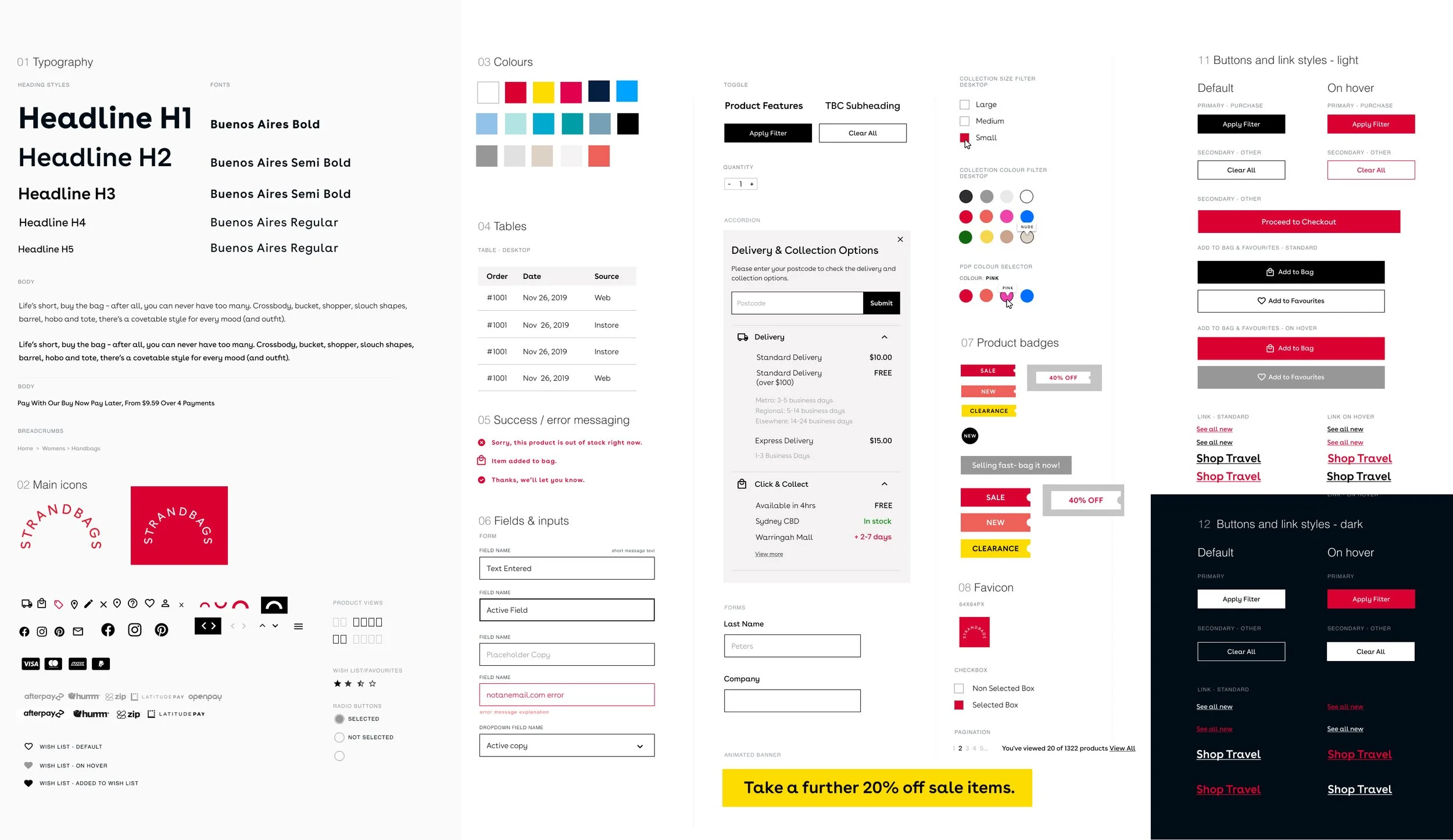
Throughout the entire process I was having regular meetings with the front and backend devs to make sure that we were on track and address any questions that we had from both parties. Once the wireframes were approved from the project team and the scope of work was signed off supplied the developer with a detailed style guide and annotated wireframes of every screen for both mobile, tablet and desktop. This helps him understand exactly what is required and helps them to create a more realistic quote for development.
SUCCESS METRICS
• Improve % of website sessions viewing a product page
• Reduce clicks to product page to 2
• Increase in sales
• Maintain bounce rate of 35% and below
• Increase in online chat sessions
NEXT STEPS
“We will continue to develop the new websites and release enhancements in 2-week delivery sprints”
The new websites have now been trading for months and we have seen a significant uplift in customer conversion! This shows that our customers are responding well to the new digital experience.
Changes to the site are now much faster to make and the business now have a platform that can sustain digital growth into the future. The new applications that have been deployed are providing the eCommerce team with significant capabilities to help to trade the site.
We are now ready to enter the holiday season with a new scalable platform ready for future business growth.
This is also just the start of the journey. We will continue to develop the new websites and release enhancements in 2-week delivery sprints. Changes currently being worked on are:
Enable personalised content across key areas of the site.
Add more payment options.
Enhance the My Account features.
Implement enhanced Loyalty options.