Canterbury ANZ Build the Team Website
Improve the Teamwear website so customers can easily customise their kits and Canterbury will generate leads and increase sales.
OVERVIEW
“How might we generate more leads for the Teamwear side of the business?”
Canterbury wanted to redesign and develop a new teamwear website that will generate leads, increase sales and allow customers to customise their own kits with the integration of a Kit Builder plugin which was developed by a third party company in the UK.
The Team: UX/UI Designer, Marketing Manager, Ecommerce Manager, Commercial Manager, Developer (in Thailand), Copywriter and various stakeholders in NZ and the UK
My Role: UX/UI Designer, Visual Designer and Project Management
Timeframe: 4 months (Proposed launch date June 1 2020)
Methods: Business Analysis, User Analysis, Problem Framing, Wireframing & Prototyping, Usability Testing and Rapid Iterations
THE PROBLEM
“The draft of the new Teamwear website and the Kit Builder integration aren’t finished and require various changes so they integrate together”
• Both Canterbury and the Developer weren’t happy with the draft Teamwear website that was initially designed and built as there was no brief or resources
• We need to integrate Kit Builder into the Teamwear host site but it requires changes so it works well when it is integrated
• There are many stakeholders in Australia, New Zealand and the UK that need to have input and approve the site before launch
• The timeframe to design, develop and launch the site is very short because the company are relying on it to help generate leads and ultimately sales
THE GOAL
“We need to create a website that customers can easily use and generate leads for the business”
Design a responsive website for ‘Build the Team’ so that the customers will have a better experience when they are customising their kit online. Canterbury can focus on marketing the site and grow awareness that will hopefully result in sales. The goal of the site was to create a site that is beneficial for both the customers and Canterbury. The main goal is to create a lead generator tool.
THE SOLUTION
“Offer customers the ability to customise their kits with ease”
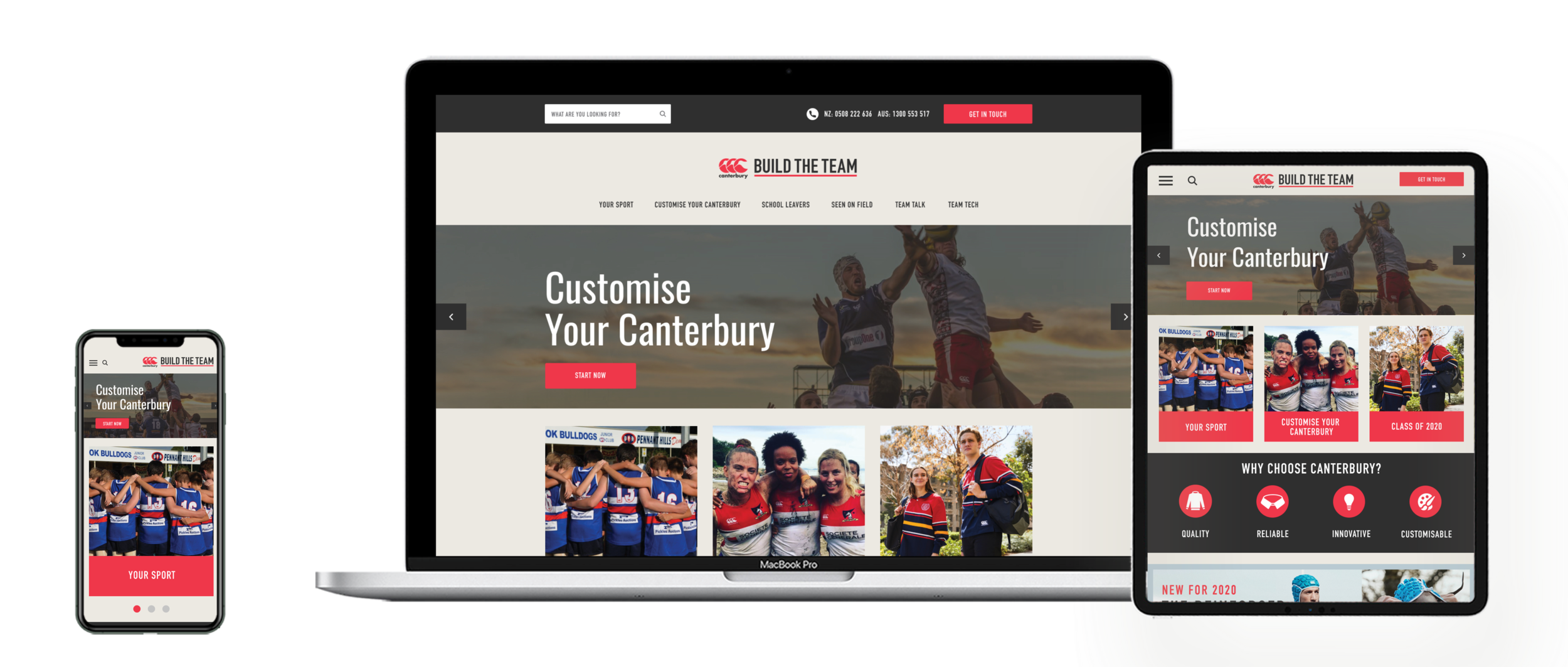
Design a responsive website for teamwear called ‘Build the Team’ that allows various users to easily ‘Customise their Canterbury’ using a plug in called Kit Builder.
APPROACH TO THE PROJECT

DISCOVER | USABILITY TESTING ON THE DRAFT TEAMWEAR SITE
“The draft site isn’t finished and could look so much better”!
Conduct usability testing on the draft Teamwear website with Canterbury employees and customers. I wanted to understand how people are using the current website and find any particular pain points they are having so I can improve the experience they have and the design of the site.
What frustrates users:
• Some of the sport sections just have dummy copy
• Leavers section has dummy copy
• Some of the top navigation isn’t essential like Fit Guide etc, these could be in bottom nav
• The home page isn’t very exciting
• Users are finding it very difficult to navigate through the website
*See the appendix for a detailed analysis of the draft site

DISCOVER | UNDERSTAND THE BUSINESS
“The purpose of this site is to generate leads”
In wanted to learn more about Canterbury and discover the business goals and pain points they have with the Teamwear side of the business and draft of the website. I prepared questions to ask the Teamwear team and various stakeholders so I could get a better understanding of Teamwear and the draft website, business pain points and goals.
What I did?
1. Prepare questions
2. Interview stakeholders & record using Otter a recording app
3. Review interview and note down key insights and thoughts
4. Use affinity mapping to organise insights into groups
After the interviews I used affinity mapping to discover and categorise key insights including:
Buisness Problems (Teamwear in general)
• Current site isn’t working with flash
• Lack of education. What is Teamwear?
• Old and not efficient process
• Customers can’t design their own kit
• There are too many touch points for teamwear
Goals
• Create a CAD mock/design using Kit Builder
• Get all info required
• Generate an increase in warm leads
• Improve efficiency
• Ability to process times
• Minimise touch points for the teamwear team
• Create a more efficient way of working for teamwear
• Create an enjoyable customer experience
ADDITIONAL PAGES AND FEATURES
• Catalogue PDFs to download
• CORE 24/7 in FAQs
• Quotes and testimonials
• Show images of kits being worn
• Instagram
HOW CAN WE MEASURE SUCCESS
• Increase in sales
• Less questions from customers
• Positive customer feedback
• We can use Pipe Drive to track sales and inquiries
• Create scenarios to test various persona tasks
Business pain points (current draft site)
• Lack of ownership
• Lack of transparency around the initial project
• The current CCC site/Kit builder isn’t working well because Flash isn’t working
• Lack of input from the team
• Wording/verbiage is hard to understand
• The draft site isn’t great - team isn’t happy
• Poor UX/UI
• No contracts/scope of work with KOS developer
• No user testing done
• High expectations
• Some client logos are supplied incorrectly
• Multiple platforms
• Time differences make it tricky for changes
Competitors
• Sports Apparel AUS
• One Sport
• Beatswear
• Paladin Sports NZ
• BLK
• ISC
• Oneils
• Reform Clothing
• Classic Sport
• Team sports Australia
• Alive Clothing Aus
• Payless promotions
• Gomd Rugby
• CSW
• Emu
• Akuma
UNDERSTAND
“Our proposed solution benefits both the business and customers”
‘Build the Team’ Value to Canterbury
• Help graphics with getting info
• CCC get paid upfront
• CCC can capture an initial design
• Sales team can now get warm leads
• Easy to track orders (school shop)
• Help to forecast the time frame
• CCC can take control of the process
• Decrease time from concept to completion
• Graphics will have better visibility of designs
• Minimise back and forth with customers
‘Build the Team’ Value to Customers
• Allow customers the opportunity to have questions answered eg. FAQs
• Personal experience when dealing with he team
• Have input in designs (Kit Builder)
• Educated and questions answered
• Better online experience (Fast and Easy)
UNDERSTAND
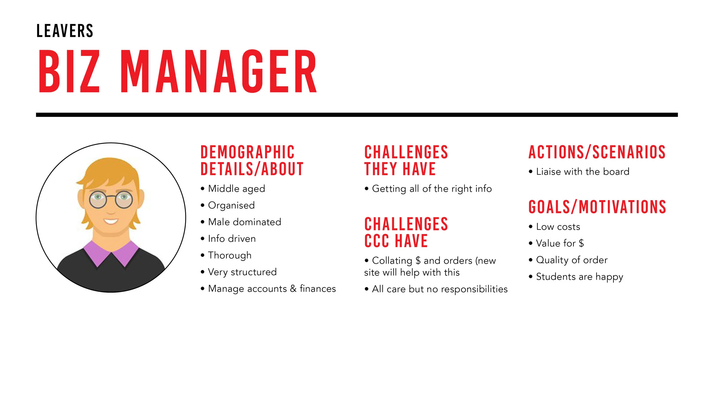
“Teamwear appeals to a variety of users”
Our proposed solution will benefit a variety of customers. The teamwear sales team helped me to understand the main personas who will be using the site based of previous enquiries and sales.
6 of the main users of the Build the Team site will be:
• Secretaries
• School Leavers
• Presidents
• Business Manager
• Gear Steward/Merch Manager/Sport Coach
• Uniform Shop and Year Coordinator
*See the appendix for the detailed personas

INSPIRATION | COMPETATIVE ANALYSIS
“What should we include on the new and improved site?”
Before sketching ideas for potential solutions, I did a competitive and comparative analysis of existing websites to see if there are any interactions and design patterns that I could potentially use in the revised e-commerce site.
*See the appendix for more details
Competitors
• Sports Apparel AUS
• One Sport
• Beatswear
• Paladin Sports NZ
• BLK
• ISC
• Oneils
• Reform Clothing
• Classic Sport
• Team sports Australia
• Alive Clothing Aus
• Payless promotions
• Gomd Rugby
• CSW
• Emu
• Akuma
Features
• Easy to understand home page
• Select Your Sport option
• Start designing is clear
• Request a quote option
• About Section
• Info About business
• Contact section
• Contact form
• You can share design
• View product at different angles
• You can download a PDF
• Easy to use form to fill in info
• Sign up pop up
• Why choose this business
• The design/production process
• FAQs
• Size Guide
• Instagram feed
• Payment options
• Price of items
• News or a blog
• Various countries to choose from
What features do the competitors have that our users will expect?
• Sign up
• Choose your sport
• Contact info
• Quote request option
• Info about the biz
• Link to kit builder
• Size Guide
• FAQs
• Testimonials
• Shipping info
• Return info
• Various ways to contact
• Sign up to the newsletter
• Instagram feed
• History/story
What features are missing in the marketplace?
• Clear info about the process
• Breakdown of on and off field items
• Personalised sales team info
COMPARATIVE ANALYSIS
“We want customers to be able to return to the site again”
Who are some comparators that offer great content and have features that make it easier for customers?
• Rebel
• Stylerunner
• Sportsgirl
*See the appendix for more details
Positive Features:
• Rotating banner
• 2x promo tiles or 1 banner
• Shop your fave brands
• Top rated products
• Clear navigation at top and bottom
• Easy to contact
Negative Features:
• Not enough inspiring images
• Need a mix of male and female focussed imagery
• Tone of voice isn’t on brand
IDEATION
“It’s time to start exploring the ideas”
Sketching
Now that I was inspired, I started to explore how users could navigate and move through the site by exploring various ideas and sketching them out on paper. I made sure to include interactions and design patterns that would fulfil customers expectations discovered in the research phase.
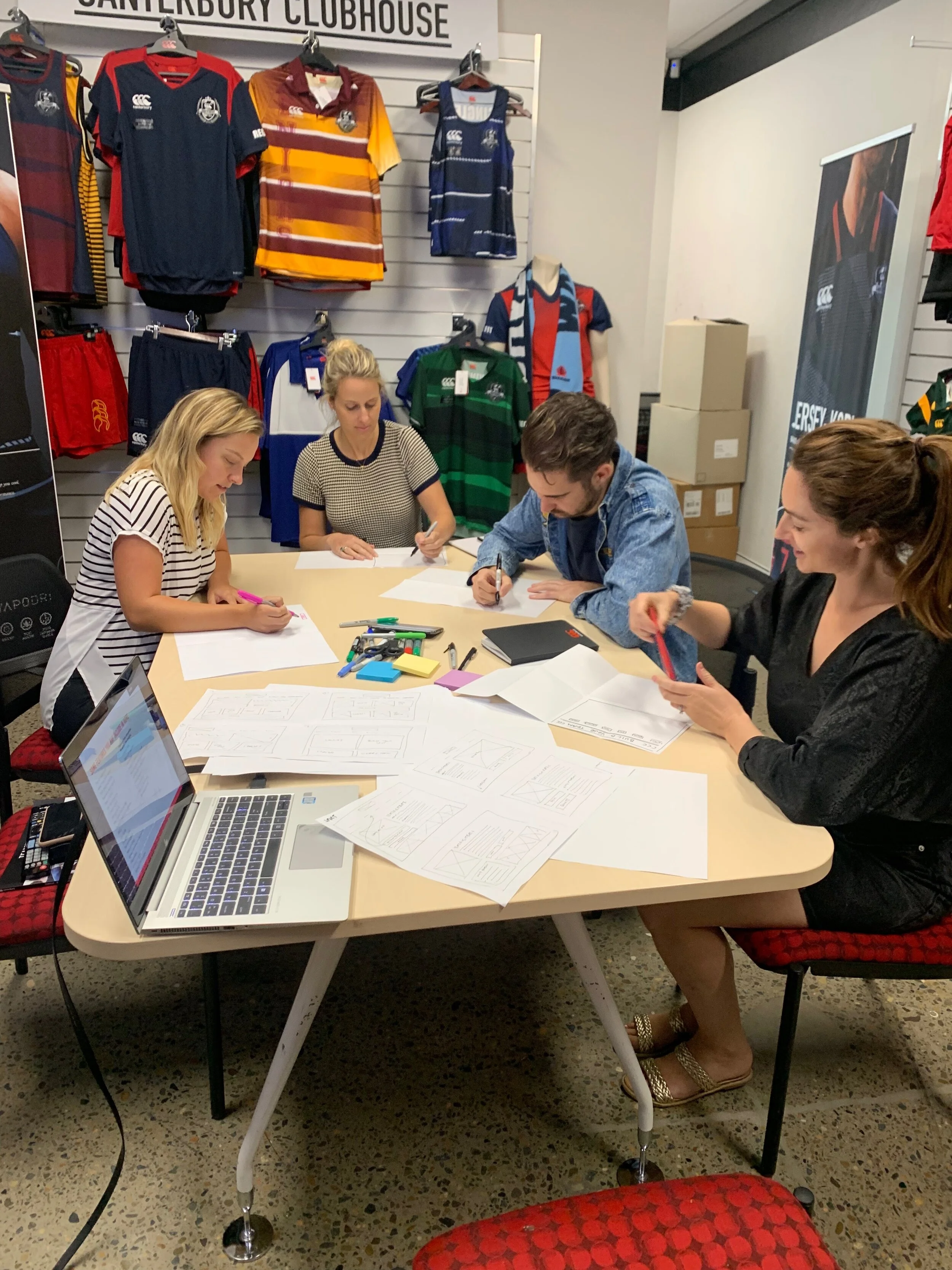
Participatory Design Session/ Crazy 8’s
Now we are inspired after doing the competitive and Comparative analysis, we started to explore how users could navigate and move through the site by exploring various ideas and sketching them out on paper with the team in a participatory design session.
I made sure to include interactions and design patterns that would fufill customers expectations discovered in the research phase.

Testing and feedback
After discussing the sketches with the team I iterated the designs. Some of the main changes I made were:
• Promo section on the home page
• Instagram feed on the home page
• Including Grassroots and Elite teams sections
• Including both the NZ and AUS phone number
*See the appendix for other features that need to be prioritised when designing
User flow
Before designing a digital prototype, I wanted to focus on discovering which wireframes were required to be produced that will allow the user to reach their goals when they are shopping on the Build the Team website. I created 3 flows for steps a user typically goes through in order to complete some common tasks: Designing a jersey, Customising a school leavers jersey and learning more about what products Canterbury offer for a specific sport.

Wireframes
Now that I knew what screens are required I started designing low - mid fidelity wireframes in Figma to test before creating high fidelity wireframes.
DEVELOPMENT | INTERACTIVE PROTOTYPE
“Does it work?”
Now that I had wireframes, it was time to create a clickable prototype to test my ideas and validate the redesign.
Throughout the entire process I was having regular meetings via Teams with a developer in Thailand to make sure that we were on track and address any questions that we had from both parties. Once the wireframes were approved from the project team and the scope of work was signed off supplied the developer with annotated wireframes of every screen for both mobile, tablet and desktop. This helps him understand exactly what is required and helps them to create a more realistic quote for development.
Link to digital interactive prototypes:
Mobile: https://www.figma.com/file/Zjm45vB2KBYtNY0Uhot5l2/CCC_TEAMWEAR_MOBILE_V1?node-id=0%3A1
Tablet: https://www.figma.com/file/J50a6w99hLmrPGcU2fFhbh/CCC_TEAMWEAR_TABLET_V2?node-id=0%3A1
Desktop: https://www.figma.com/file/9A67JbZLzKgLxn5K9yjvXh/CCC_TEAMWEAR-SITE_DESKTOP_FINAL_V5?node-id=0%3A1
Mid Fidelity Wireframes

Hi Fidelity Wireframes
VALIDATION | USABILITY TESTING OF THE HOST SITE
“It’s really great being able to play with an interactive prototype”
Now that I had an interactive prototype, it was very important to see how people used it and if they had any feedback about the flow or features of the website. I sat down with 5 different users, a design professional and members of the Teamwear department to see how they navigated around the interactive prototype and see if they could offer any valuable feedback.
Scenarios we created to test if we had all the necessary functionality:
• Designing a jersey
• Customising a school leavers jersey
• Learning more about what products Canterbury offer for a specific sport
Iterations made to make the solution better:
• Including a toggle navigation on then mobile
• Made all of the fonts smaller
• Included drop down in nav with images
VALIDATION | USABILITY TESTING OF KIT BUILDER
“Kit Builder is very B to B focused and we need it to be more B to C”
The initial brief to the company in the UK who built Kit Builder was to make it B to B focused but that isn’t what we wanted for our site. We require our customers to be able to visit the site and customise their kits with ease and minimal confusion.
Iterations made to make the solution better:
• Education around the fits and garment styles
• ‘Previous’ and ‘Next’ buttons need to be included
• The storyboard needed to be redesigned so that it looks great and has all of the information that a customer may need and that can be shared
• The stage in the process wasn’t clear so we added this in
NEXT STEPS
“What will we need to do in phase 2 of this project?”
• Once Kit Builder has been integrated into the host site, we need to see how it appears on all devices and in various browsers
• Conduct usability testing of the site with various users and complete the entire journey from end to end using scenarios
• Kit Builder could be redesigned so it looks more modern and looks similar to the ‘Build the Team’ website
• Tweak the output received once a customer has either filled in the contact form or submitted a quote in the Customise Your Canterbury section
• Maintain the content on the host site so it is fresh and current