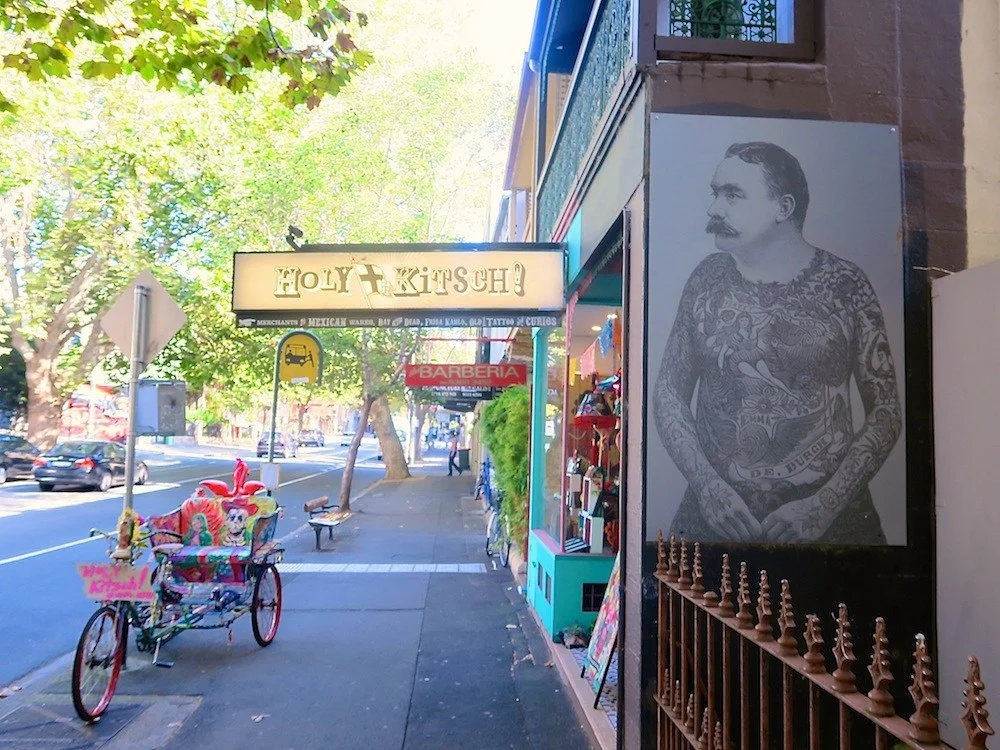
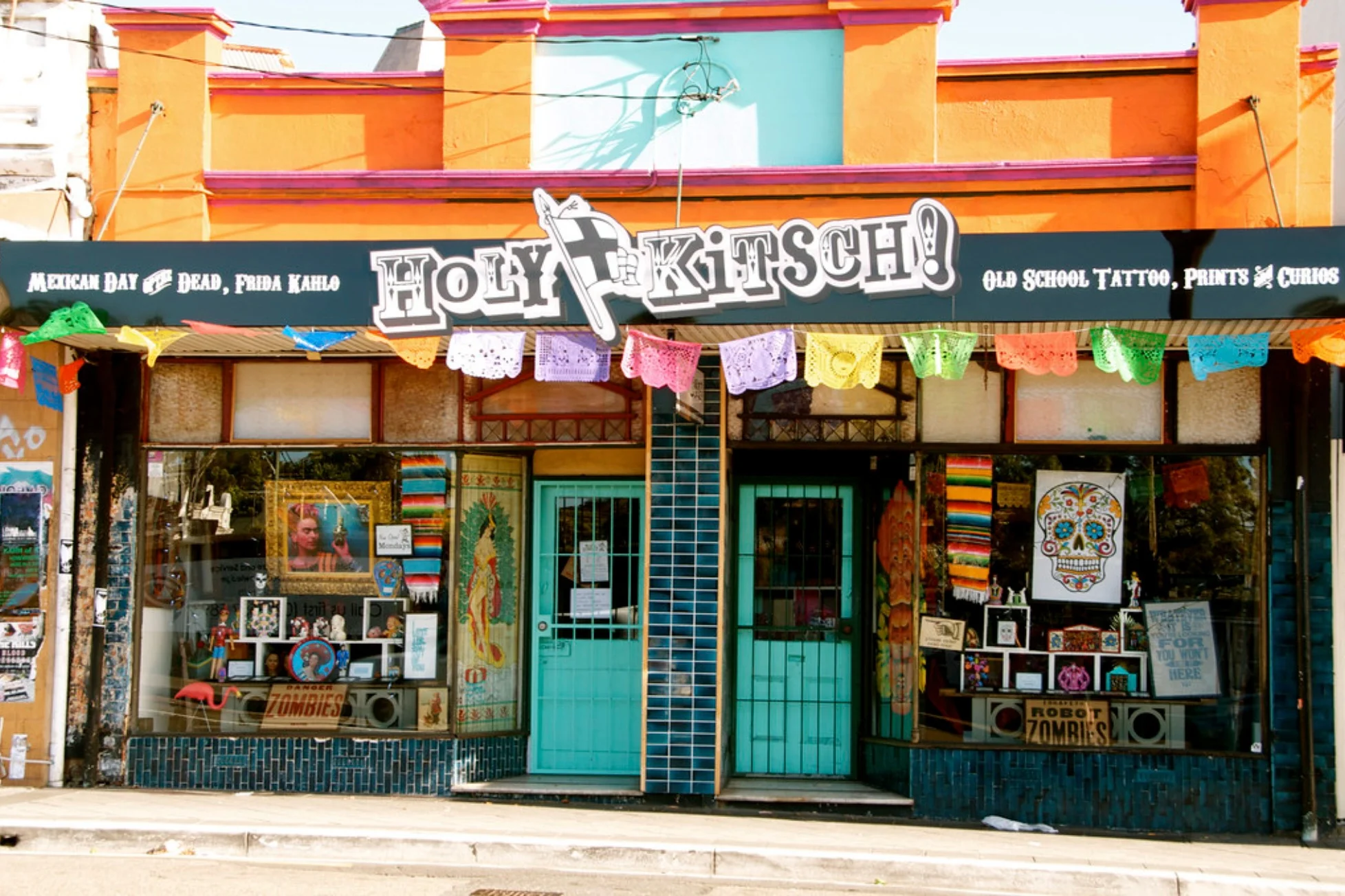
Holy Kitsch!
How might we improve the customers shopping experience so that it reflects the one they had when they visited the old brick and mortar stores.
OVERVIEW
Local bricks & mortar shops can’t escape e-commerce!
Holy Kitsch!, a self-funded artist's enterprise no longer has any brick and mortar stores. Customers can only purchase products from the Holy Kitsch! website which is also the main source of revenue for the business.
My Role: UX/UI Design Lead (solo project)
Timeframe: 2 week sprint
Responsibilities: User research, problem definition, UX/UI design, IA & navigation design.
Methods: Interviews, competitive and comparative analysis, card sorting, affinity mapping, user flows, paper prototyping, high fidelity wireframes and prototypes.
THE PROBLEM
“The current site doesn’t reflect the old brick and mortar stores”
The current Holy Kitsch! e-commerce site doesn’t reflect the ‘art gallery’ vibe of the old brick and mortar store. Usability testing of the site showed that there were also a number of challenges relating to the information architecture that made it difficult for people to purchase a product.
The most common pain points were:
• It is very hard to find the SHOP and account section
• There is too much copy throughout the website
• The navigation is hard to understand
THE GOAL
“Holy Kitsch! needs a better e-commerce site because it was going to replace the brick and mortar stores”
Discover how users respond to the current e-commerce experience, discover pain points and propose a solution to improve their shopping experience that reflects the one they had when they visited the old brick and mortar stores.
THE SOLUTION
Improve customers shopping experience so that it reflects the one they had when they visited the old brick and mortar stores
I redesigned the Holy Kitsch! e-commerce site so that customers have a better experience when shopping online and the owner of Holy Kitsch! will also be able to continue writing content and hopefully make more regular sales.

APPROACH TO THE PROJECT

DISCOVER | UNDERSTAND THE BUSINESS
“The stores were designed to be like an art gallery”
Interviewing Noni, the owner of Holy Kitsch! allowed me to discover her goals, challenges and desired featured for the Holy Kitsch! e-commerce site. After the interview, I listened back to the audio recording and used some research techniques including affinity mapping and a business model canvas map to discover and categorise key insights including:
Goals
• Redesign the site so it reflects the arty vibe of your previous stores
• Increase the amount of sales
• Improve the awareness of the e-commerce website
Challenges
• People don’t know that Holy Kitsch! has an online store
• The site isn’t making many sales
• There’s more competition now
Desired features
• Opportunity to include copy and quirky navigation/wording

Usability testing of the current eCommerce site

Affinity mapping

DISCOVER
Behaviours and attitudes of ‘The Influencer’
The artsy vibe of the brick and mortar stores attracted many kinds of people including the “Influencer” so I wanted to focus on this group of people. I carried out further user research with a similar persona called Sally to combine the findings and realise the goals and challenges of the Holy Kitsch! customer. I identified several trends through the persona and user interviews.
What the “influencer” wants
• Buy quirky, original, or on-trend products
• Purchase products on-the-go
• Get items delivered quickly
What frustrates the “influencer”
• The current website is very busy so it is hard to find what you’re looking for and purchase a product
DEFINE
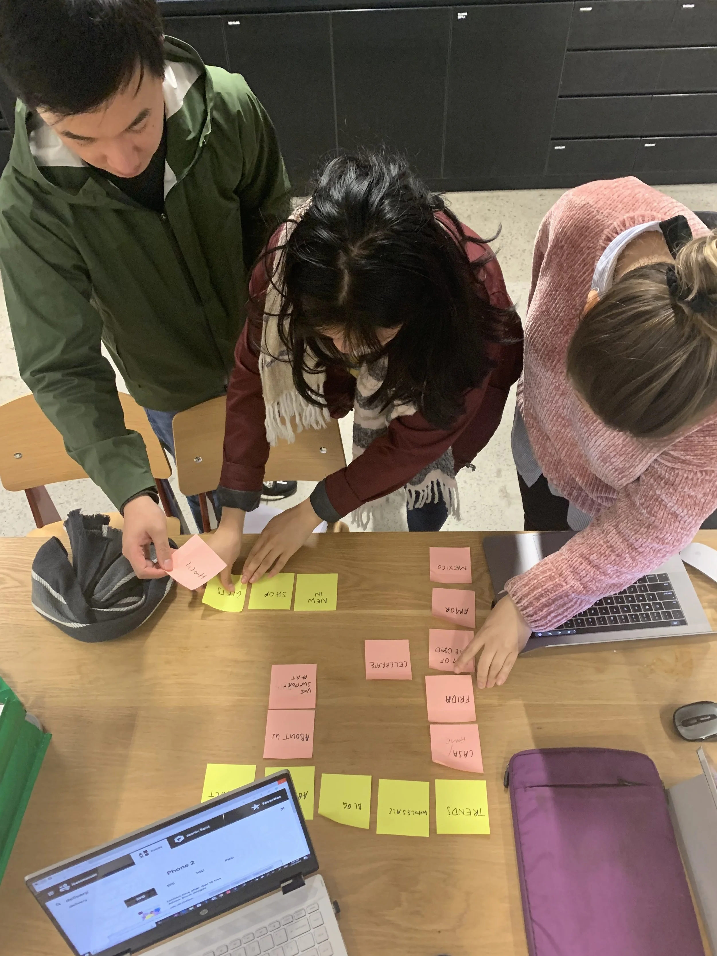
Making the site easier to navigate around
I took the key findings from the initial usability testing and used card sorting as a method to examine the existing information architecture. My goal was to make the website easier for customers to understand and ultimately purchase a product on the site with ease. In the solution I incorporated a ‘THEMES’ section so customers can easily see the types of products they could buy.
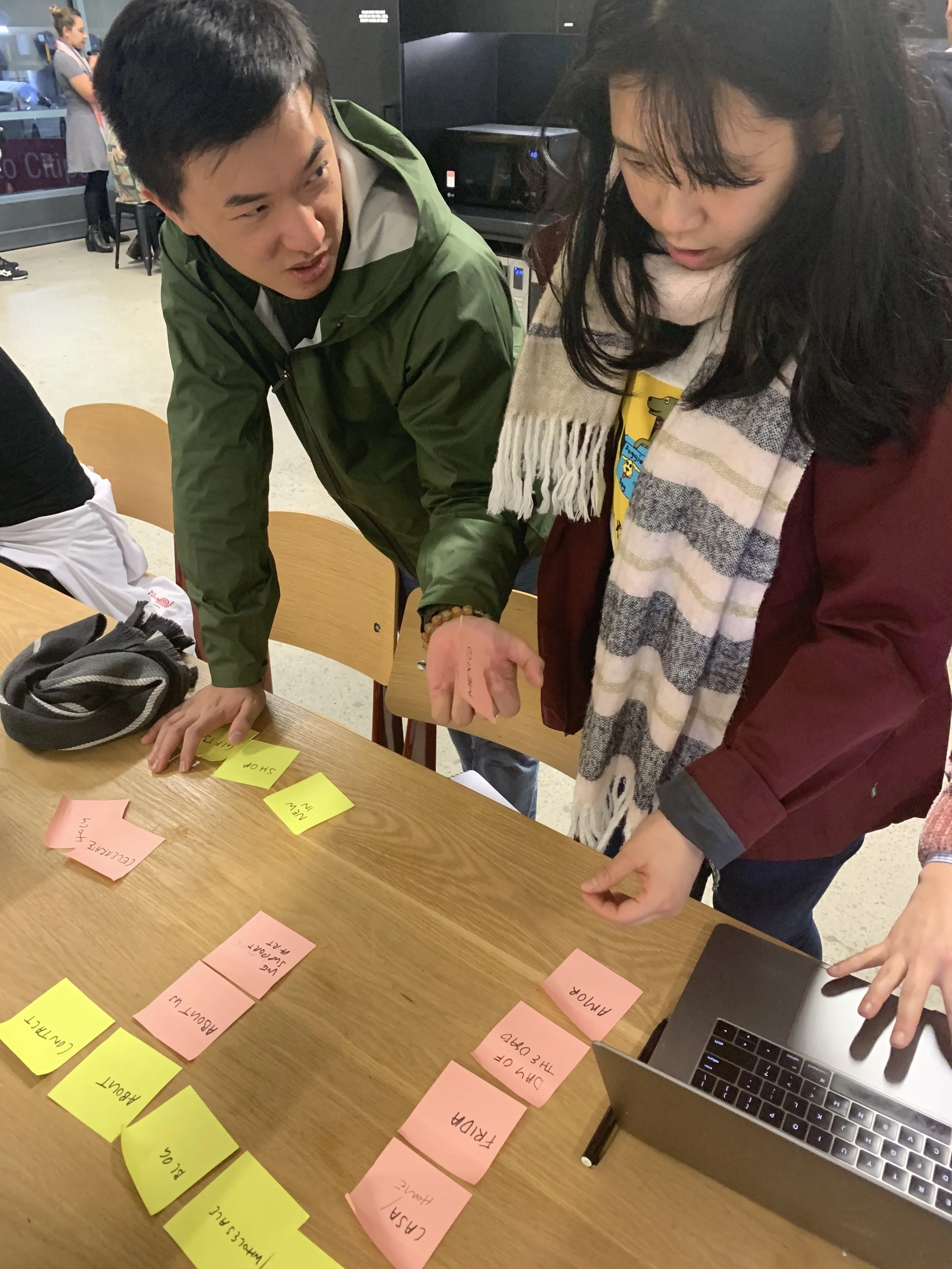
Card Sorting
User Journey
Sally is going to her friends birthday in a few weeks and wants to buy her a Frida Khalo mirror she saw on instagram.


User Journey Map
IDEATE & DEVELOP
Developing the solution
Sketching
Now that I was inspired, I started to explore how users could navigate and move through the site by exploring various ideas and sketching them out on paper. I made sure to include interactions and design patterns that would fulfil customers expectations discovered in the research phase.
User flow
Before designing a digital prototype, I wanted to focus on discovering which wireframes were required to be produced that will allow the user to reach their goals when they are shopping on the Holy Kitsch! website. I created 3 flows for steps a user typically goes through in order to complete 3 common tasks.
An example of a user flow and diagram:
Sally is going to her friends birthday in a few weeks and wants to buy her a Frida Khalo mirror she saw on instagram
Paper prototype
The next step was to communicate and test my proposed solution and ideas with the target audience so I created a paper prototype of the site’s key screens and asked people to do a scenario.
Testing and feedback
After showing the client and potential customers the sketches I iterated the designs.
Some of the main changes I made were:
• Removed the NEW IN section because the client said they aren’t adding any new products
• Included a blog section because the client wanted an area where she could write interesting articles
• Included a ‘Sign up to the Newsletter’ and instagram feed to please the ‘The Influencer’
Wireframes & Interactive Prototype
Now that I had wireframes, it was time to create a clickable prototype to test my ideas and validate the redesign.
Link to digital prototype: https://www.figma.com/file/zqa6YhudlIyIhmz0Qwdeyy/ITERATION-V1?node-id=0%3A1
VALIDATE
Usability Testing of the Digital Prototype
Now that I had an interactive prototype, it was very important to see how people used it and if they had any feedback about the flow or features of the website. I sat down with 5 different users, a design professional and Noni to see how they navigated around the interactive prototype and see if they could offer any valuable feedback.
Iterations made to the prototype
• The checkout process was very overwhelming with all of the billing, shipping, and payment info all on one page. So I reworked it so I could cover up the sections and you can continue once you’re done with each section.


SOLUTION RECAP
Was the proposed solution successful?
The proposed solution allowed Sally, the main archetype to find and purchase products easily on the redesigned website. Noni, the owner of Holy Kitsch! was very happy with the proposed website redesign. She said that it is easier to understand and she cans till continue to write copy in the blog section.
NEXT STEPS
Future developments
• Do some more usability testing on the checkout section to see if the iterated design makes it easier for customers
• Explore other words to use instead of ‘CASA’ because some people don’t understand what it means
• Develop the visual design for a hi-fi prototype
• Think about how the content will be created for new sections like the blog
LEARNINGS
If only there was more time!
I really enjoyed this project because I am interested in Mexican art and I had been to the physical brick and mortar store in Surry Hills. It was great dealing directly with the client because it helped me to iterate my design so that ultimately the proposed solution met not only the customer/users needs but Noni was happy.
If the project was longer or if I had more time I would have loved to complete the UI side of the prototype.